Proximity
Proximity in design simply means that objects near each other are seen as a unit. It really is that simple and it’s something you see every day. On your web page or your business card, related information is placed closely together and it forms a visual unit.
Often when people are getting started with design, there is a temptation to throw everything on the page and fill up every square centimeter of space with type and images. However, it makes information difficult to digest and really doesn’t look good.
Using the principle of proximity, you’ll find as you group those items that have something in common, and separate those items that don’t, a clear visual hierarchy stands out on the page. And that’s what proximity is all about.
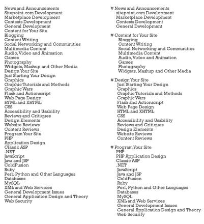
A practical example is a list, for example a sidebar in a blog. Blog sidebars generally consist of lists such as categories, links, and recent posts. See how the second list consists of the same things but is clearer to see:
Proximity in design simply means that objects near each other are seen as a unit. It really is that simple and it’s something you see every day. On your web page or your business card, related information is placed closely together and it forms a visual unit.
Often when people are getting started with design, there is a temptation to throw everything on the page and fill up every square centimeter of space with type and images. However, it makes information difficult to digest and really doesn’t look good.
Using the principle of proximity, you’ll find as you group those items that have something in common, and separate those items that don’t, a clear visual hierarchy stands out on the page. And that’s what proximity is all about.
A practical example is a list, for example a sidebar in a blog. Blog sidebars generally consist of lists such as categories, links, and recent posts. See how the second list consists of the same things but is clearer to see: